The information architecture of moodle can be rather confusing for both students & tutors.
One of the reasons for this, suggested by our users, is that in comparison to most other web based content management systems moodle has no clear separation between the course editing settings and the front end.
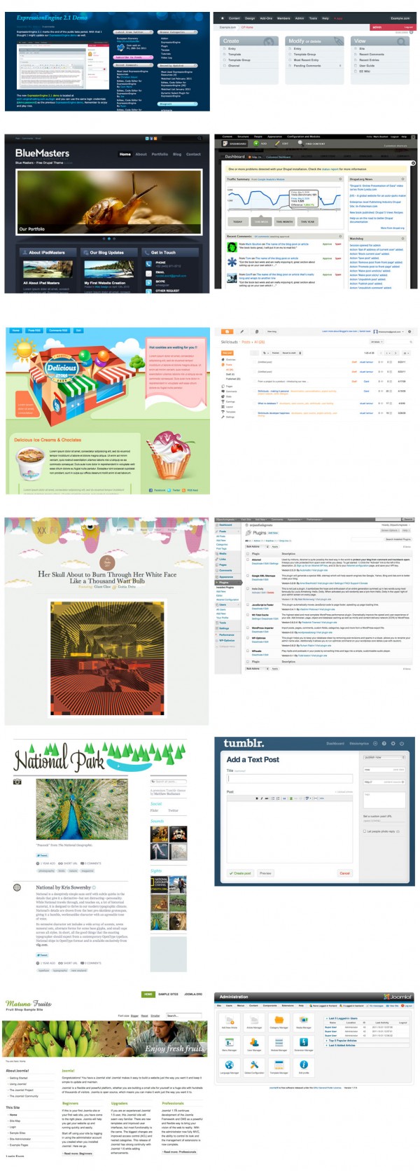
Having this separation of a front end user interface & an editor facing interface is a well used pattern which makes it simpler for content editors to know where to perform a task. It makes your web pages a lot less cluttered. It also helps emphasise to editors what students can see, and cannot.
Front end vs editor patterns from popular cms
{click the image for larger view}
For most web based cms the differences between the front end most users see, and the editor interface are very clear. The workflow editors follow is clear. The front end ui remains uncluttered by admin links, and the dashboard user interface is clean and simple.
For our moodle at Sussex we will be launching a new development which tries to bring moodle more inline with these other cms by introducing an editor dashboard pattern.
A dashboard for moodle
Click here to view the embedded video.
We already have exciting plans on how to improve this moodle dashboard. Once you have a simpler editor pattern & information architecture you already know exactly where new features/content live – it makes extensions and new developments much clearer. I’m sure you can all think of some too!
The changes for our users are obvious, but introducing this separation also has some technical implications.
Technical advantages
From a technical perspective separating out these content editor parts of your cms from the non-editing user view you stand to make your system leaner and cleaner.
Web based cms generally have a standard look for the editor pages, while the non-editor view can have a custom theme/skin. Editor pages are, by their nature, heavier in load of javascript, css, php and database queries – while the non-editor view can often be extremely light with less db/php but could have js intensive or fancy ui interactions. The separation allows you to only load what is necessary (a particular js library,css, a db query) for the type of user – giving both admin and non-admin a better user experience.
By separating an editor pages writing a theme becomes much easier – you only do so for the non-editor pages. Writing a plugin becomes much simpler – the admin ui only has to work with one theme – the default cms editor theme.
The future of moodle?
This information architecture pattern of separating the editor/admin and users view can be seen all over the web, and we would very much like to see it as an information architecture pattern adopted by moodle at some point in the future. As always, your comments are very much welcome.
